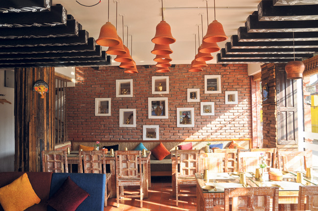
From refurbishing counters with reused wooden planks to turning pani puri wagon strollers into a restaurant’s condiment stand, Prajal Pradhan’s range of incorporating recycled decor in his interior designs is certainly impressive. His ideas are clever and provide a much needed breath of fresh air where decoration options are concerned. The Week caught up with the architect for his insights on the prospects of recycled decor ideas.
Text: Priyanka Gurung
Photos: Pratik Rayamajhi
Is recycled decor a new trend in the interior design circles?
Not really, there aren’t many people who can to whole heartedly incorporate recycled decors as a theme. I assume some designers prefer to stay away from it because it is very risky and time consuming. There is always the possibility that the results will be different than your expectations.
My first attempt with this recycled decor theme was the restaurant, De Rustic and that’s mainly because they had a limited budget of around Rs 150,000. You can’t restyle an entire restaurant with that money. It was shocking at first but eventually, the challenge led to some very creative ideas.
Do you think those interested can attempt a DIY style renovation with recycled decor?
One has to keep in mind that there is a thin line between shabby and rustic. You have to be very careful not to cross this line and for that, I’d say some research and expertise are required. Recycling random items into decor items looks like a lot of fun but it can be tricky. It will certainly consume a lot of your time. But sure and, if you are ready to put in the effort and time, go ahead.
When you first attempted to decorate an entire restaurant space with recycled materials, were you surprised with the results?
The budget limitation certainly forced us to be really creative. We wouldn’t have gone down this route if we weren’t restricted in this manner. However, it was a lot of fun. The key word here is experimentation. We did a lot of that and there were some unsuccessful ideas. There are some aspects that I’m not completely satisfied with, however, all in all, it was an interesting project. There are many inspirations to take from it as well.
The imitation game

Now that you have worked with this theme a number of times, have you tried putting a new spin on it?
The budget is a big influence on the concept we try. While working on De Rustic and the recently opened Bajra café, we had to be innovative with many recycled items but one can up the scale of their interiors with this theme as well. An apt explanation would be the work we did at Hotel Swornim in Naxal.
At this boutique hotel we tried a Newar fussion theme. The hotel has been designed keeping in mind the owner’s Newar heritage and culture.
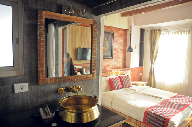 Decor items have been sourced locally to support and highlight the craftsmanship of local artisans. Hand-embroidered furnishings, paintings and custom accessories offer a great visual appeal. Here, what we basically did was recycle ideas and customs and incorporated traditions into modern designs. The results have been very interesting.
It’s a concept that people can try in their own homes as well. Even if they can’t go for elaborate designs, sometimes, it’s only a matter of creatively placing old traditional items as a gaghri or god and goddess’s statues in appropriate places.
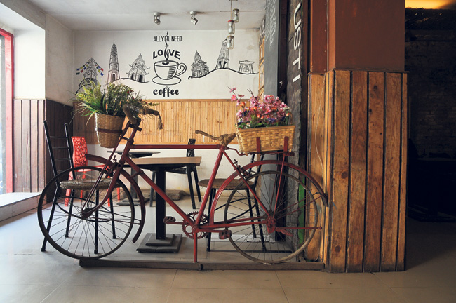 We bought this old bike, painted it red and stuck it on a metal holder. It was really that easy. It’s the most popular piece among the guests here. People tend to take many pictures with it. But this bicycle also serves a purpose. It’s not only a decor but also divides these two spaces between the cafe corner and the actual restaurant space.
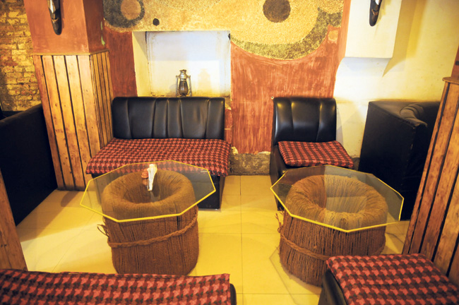 When you are recycling decor, there are very few things that can’t be used. One just has to be willing to experiment. We have glass tables that have been propped up on tires neatly bound together with fiber ropes. We have even used the dish used to mix cement at construction sites as our main sign board. There was even an instance where we discovered a huge tree branch lying on the side of the road. We cleaned it up and placed it in the corner with some light displays at the bottom. It all works well with the space.
There are other projects where I’m using cement blocks as bedroom side tables or cleaning out old TV and turning them into book shelves. Experimentation can lead to many innovative pieces.
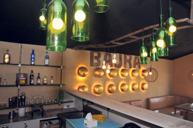
You usually have to spend a fortune if you want to buy lamps in interesting shapes. But here we just used things that were lying around our homes. From funnels to jam jars, with a little creativity, anything can be an option. I have used this concept at other project sites as well. It’s fun, makes your decor unique and, to top it off, is really cost effective.
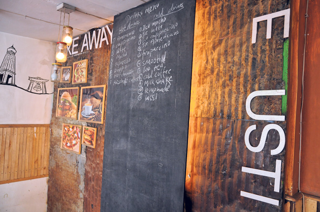 On a closer inspection, you will see the whole rustic vibe of the place is built with these sheets of tin spreads. These were actually barrels that we collected from junk yards around the Bagmati riverside. Since we were on a tight budget, this was a great option for us. We had them flattened out and we have used them as backdrop on different areas of the restaurant.
Preserving and protecting your chalk drawings
It could be your favorite quote or a funky art work, either way chalk drawing on surfaces can be a trendy addition to your interior. And contrary to popular belief, there is way to preserve all your hard work and make your chalk drawings permanent.
To make your chalk drawings permanent, lay your chalkboard out and carefully spray it with a thin even coat of hairspray from at least 10 inches away. Make sure you cover the surface entirely and evenly. The aerosol is important because it sprays small even droplets.
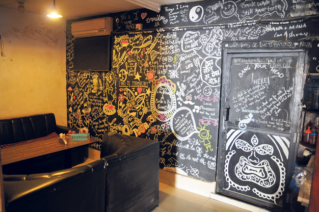 Disclaimer: It will probably look like the chalk is disappearing because the hairspray makes it wet. Don’t panic. Wait 10-15 minutes for the hairspray to fully dry and during that time do not touch your chalkboard. As the hairspray dries, you’ll be amazed to see your drawing re-appear. When the hairspray is completely dry, your drawing is protected.
Note: It’s important to know that not all hairspray is created equal. For this use, your hairspray needs to be:
• Aerosol
• Ingredient should be water, not alcohol.
• Free of silicones (that includes ingredients like dimethicone or trimethicone)
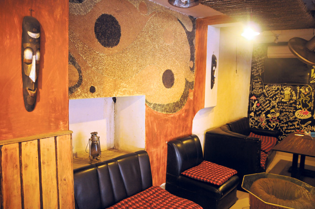 We have used different themes to decorate the walls around this place. There are all very easy methods and had some very interesting results. There are spaces where we made our own murals with beans, wheat, dal and so on. All we needed was some fevicol. I do recommend that you make these murals on isolated spaces as too much contact might ruin it.
Also there are small corners where we simply applied Nepali paper on the wall. Again, all we needed was fevicol. There texture made it look like wall paper itself.
